
RSS feed | Mastodon | Chickem Comic issue #1 | The Zen of Kayaking (2024), an Infocom style text adventure.
July 23, 2026
Images sourced in this article are done so under the terms of fair use for commentary purposes.
 Note: more than one painting displayed includes artistic nudity
This page serves as a journal for investigating the box artwork design of Paradise video cards. Those that were sold from 1987 to around 1995, prior to the first 3D accelerators, let alone the popular ones. These cards were used mostly with DOS, Windows 3, early Linux, and other various operating systems of the era.
I wrote this commentary based on my own impressions of the impressive artwork that appears on Paradise video card boxes from 1987 to 1995, and the additional non-Paradise related artwork I found via library research. Over the last 20 years of occasionally seeing eBay listings for these boxed video cards, I would always have the passing thought of wanting to know a little more -- and now I have arrived.
I spent many days locating secondary material and images for box art from scans of computer magazines to find additional product images. Everything here is the result of thinking and typing into a text editor (emacs), and proof read by another human pixel turkey for editing feedback (as mentioned in this Patreon post).
About me: I am working on indie gamedev, with artist and collaborator pixel turkey on early 90s DOS period styled adventure, and platformer games. To support or hear about that in the future, there is a patreon, you can add the RSS feed for this site to your RSS reader, and follow on itch.io. I was born in Australia in the 1980s and grew up here. I have been programming in C since the early 2000s, and have also wound a path through x86 assembly, Scheme, Haskell, and Haxe along the way.
This page is not a comprehensive catalog of every Paradise video card, but rather a look at a few of those that maximised the attractiveness of the design of the packaging with professional illustration. There is little to remark on for most pre-VGA Paradise box artwork/design, as the previous designs were not given a lot of visual fanfare.
To give you an idea of what I mean, here is the Paradise Modular Graphics Card from 1985:
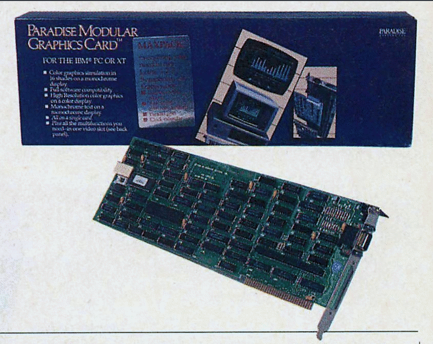
Image source: PC Tech Journal Mar 1985.
The following image is the print advertisement for an EGA card in the following year. The box design (photo not available) is based on the graphics shown in the print advertisement, which emphasises business producitivty software:
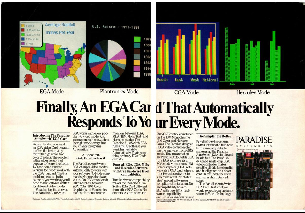
Image source: PC Tech Journal Sept 1986.
Not terrible, but not exactly selling a vision with the box art here. In some respects in 1985-1986 they were between a rock and a hard place given that some people were only working with monochrome, 4 colour CGA programs, and business software that used 16 EGA colour modes. EGA does offer a rarely used mode too, which gives 16 colors from a possible 64 at a resolution of 640x350. Yes (before anyone comes at me to defend low colour modes), very satisfying results can be had with just the 16 EGA colours for art and games at 320x200. It is not until 1988 with one EGA card, and 256 colour capable VGA cards, did Paradise up their game for box artwork.
If anyone has well-lit, clear photography for Paradise boxes etc. not shown here and would like to give permission for me to use them, please email me:  .
.
Let's look at that first then.
The grand illustrated 2D box art period lasted for just a few years before 3D acceleration dictated box designs integrate new tantalising 3D renders of demonic/carnivalesque/flaming/ultra-shiny/apocolyptic/blow-your-hair-back themes. However, that can be covered quickly because Paradise (Western Digital) only had one 3D accelerator card launch in September of 1995. The launch happened only a few days before selling the Paradise business to Philips.
The Paradise Tasmania 3D box art featured a 3D render of a fierce looking killer3D shark:
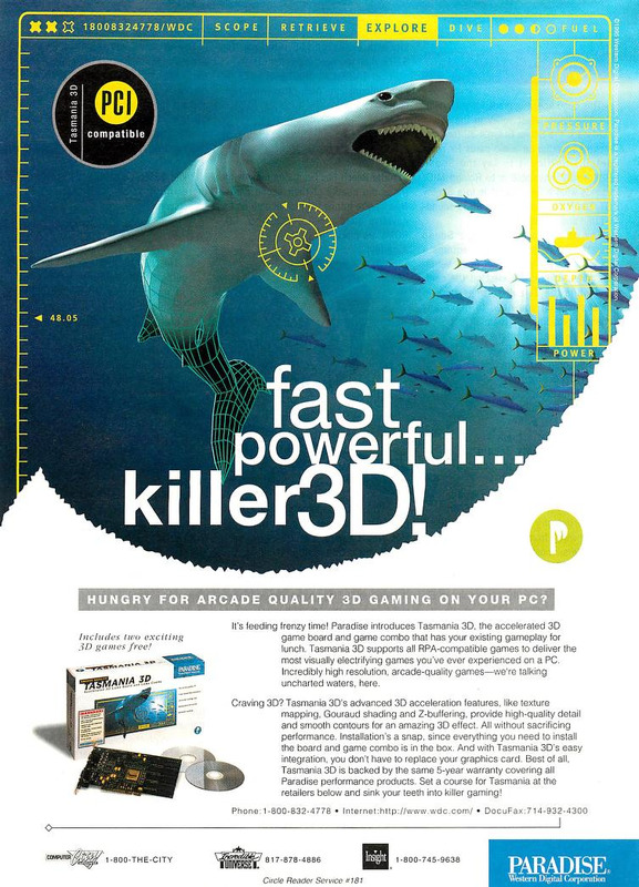
Image source: Computer Gaming World Dec 1995.
Print ads ran for the Paradise Tasmania 3D in November-December of 1995.
Philips Semiconductors ended their use of the Paradise brand in August of 1996:
        Sunnyvale, Calif. - Philips Semiconductors is shutting down
        the Paradise graphics-boards business unit that it acquired
        from Western Digital Corp. about 10 months ago.

        As of Aug. 9, the company has been quietly letting go the
        unit's 40-odd employees. A spokesman said, however, that
        Philips would keep Western Digital's graphics-IC business
        and its intellectual properties that came with the Paradise
        board-unit acquisition.
Source: Philips sees no 'Paradise' in graphics boards Electronic Engineering Times (Aug 19, 1996).
Paradise Pipeline 64 shared similar overall box design to the Tasmania 3D box. The Pipeline 64 artwork featured a surfer riding a wave pipeline. The foreground pipeline was composited with a rather flat and serene water view with two distant wind surfers as an extended strip of film reel. It was marketed as a general multimedia card, with support for MPEG video upscaling.
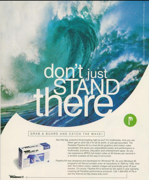
Image source: Windows Magazine Vol 6, No. 11 Oct 1995.
The Paradise brand was also used later, but I do not have a firm timeline or many specifics. I found a file dated 25th of September 1995 from "Micro House Select Source", a 1990's hardware support database product, which has a footnote for a Paradise video card entry: "Result of Relialogic purchase of Paradise Systems". Details on the purchase or transfer of ownership do not appear to have been made public.
Of later Paradise branded cards that have evocative names, I have only seen a Hawaii 128 eBay listing which features a photograph of a red macaw for the box art. This leaves little to suspect boxes from this period continued in the earlier illustrated style.
Sourced from the 1999 archived paradisemmp.com website.
These first few box front images for Paradise video cards can be found in various BBS/CD GIF collections, such as GIFGALAXY. Those gif collections often have assorted scans of travel and nature photos, and the video card box scans having had a nature theme led them to exist in that category.
Date: 1987
Links:
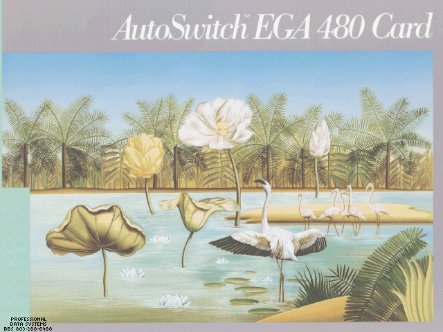
Image source: GIFGALAXY.
The design of the AutoSwitch EGA 480 Card (1987) artwork is recognisable as a direct allusion to Henri Rousseau's landscape painting, The Flamingoes (1907):
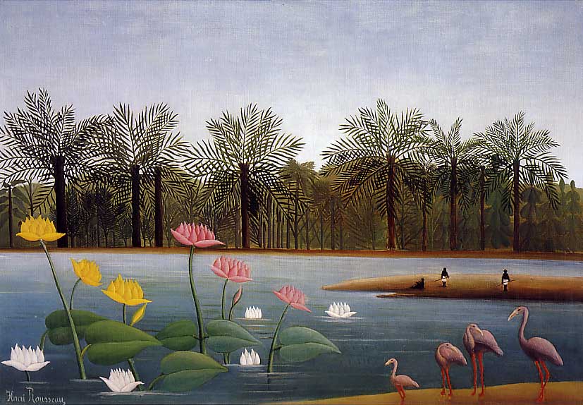
Image source: Wikimedia.
Between the two, the distance and type of the far trees, the sand bar, and the presence of lotuses are all approximately similar. I recognised the similarity of the composition almost immediately when reviewing the AutoSwitch EGA 480 Card image.
8 and 16-bit ISA cards.
Date: 1988
Links:
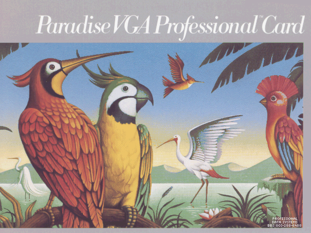
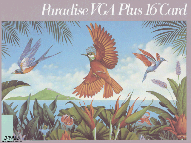
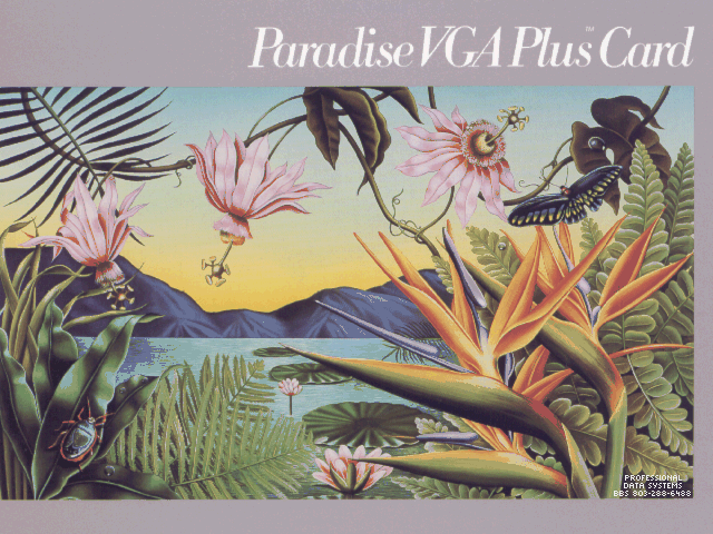
Image source: GIFGALAXY.
16-bit ISA. 512KB.
Date: 1991
Links:
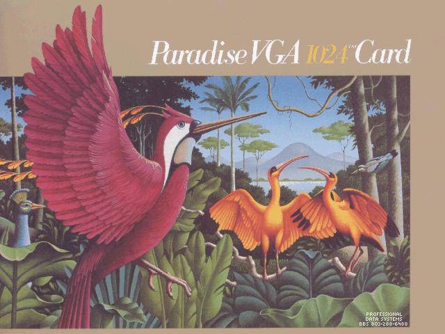
Image source: GIFGALAXY.
Date: 1992
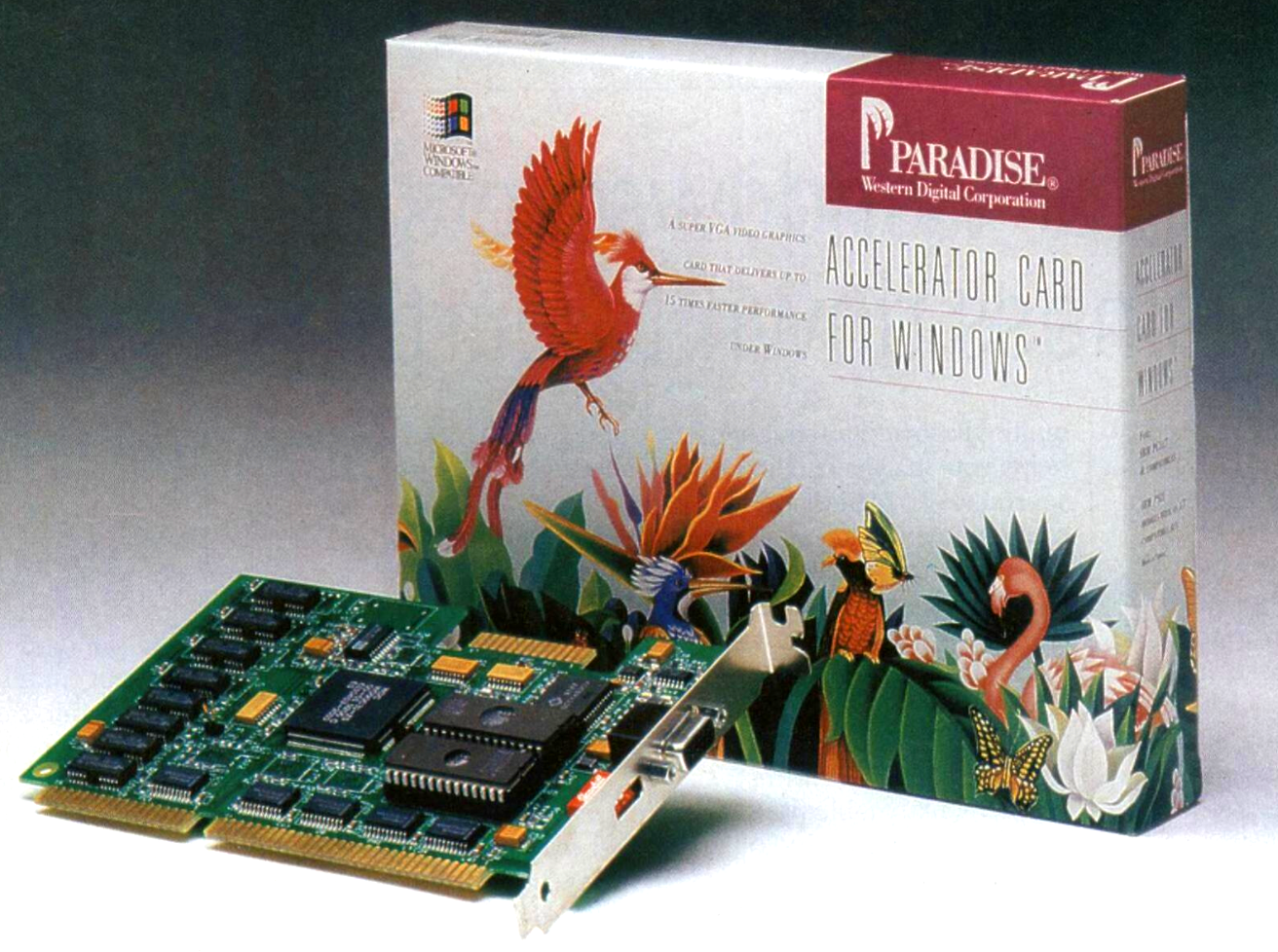
Image source: APC Nov 1992.
Date: 1993
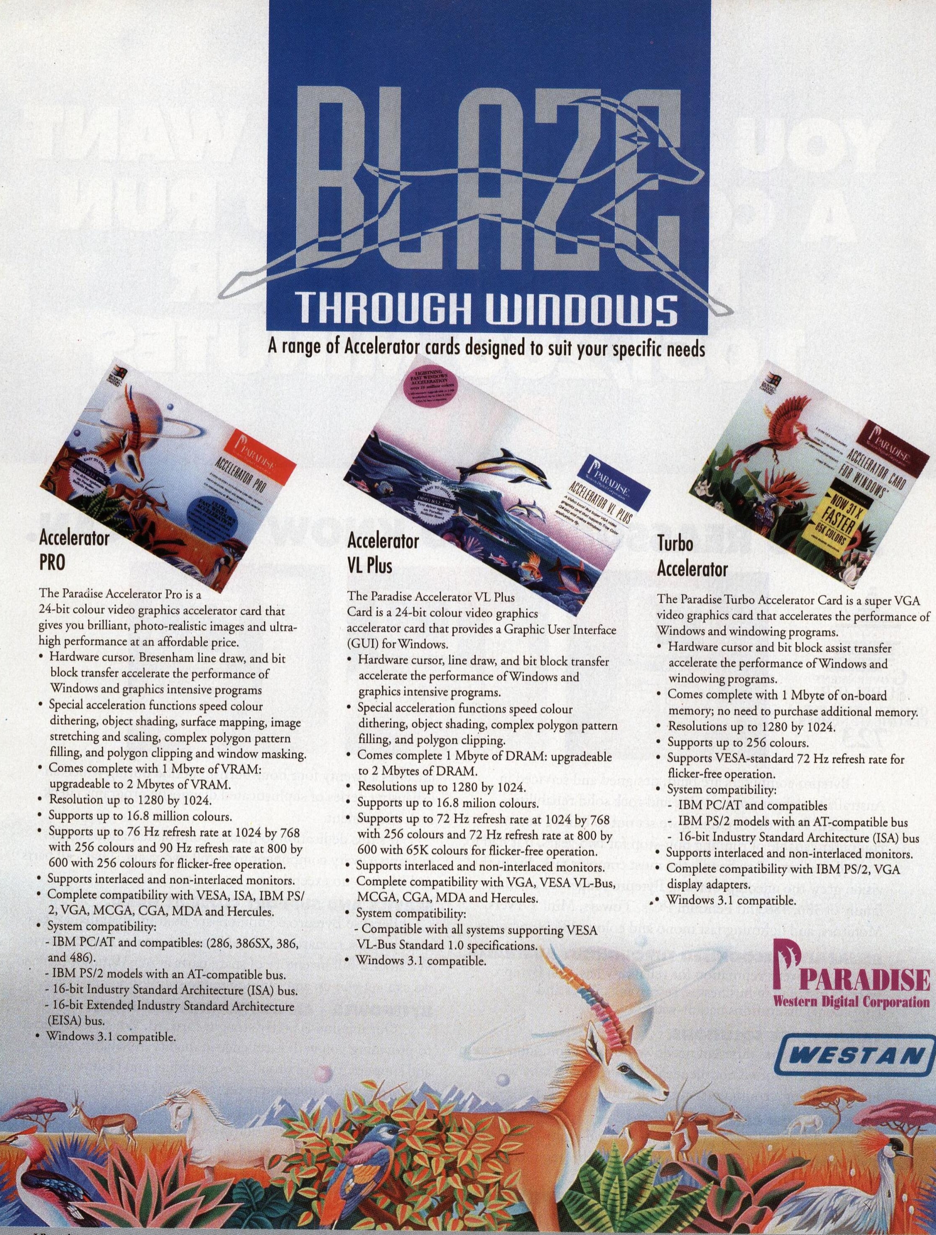
Image source: APC Nov 1993.
Date: 1993
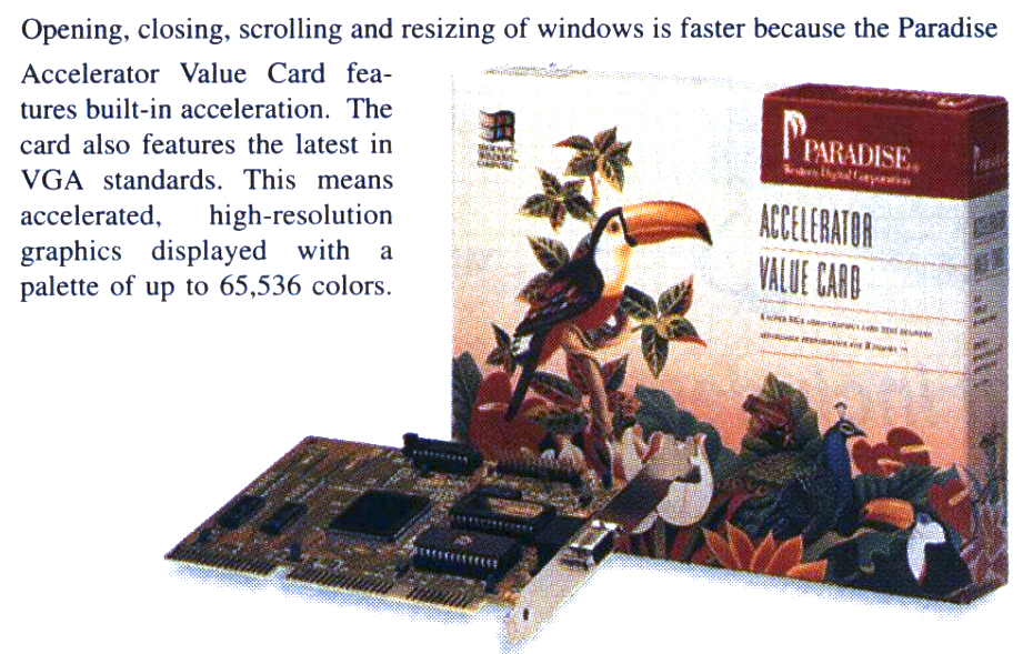
Image source: Computer Shopper Mar 1994.
Date: 1993

Image source: Computer Shopper Sept 1994.
Date: 1994

Image source: Computer Shopper Aug 1994.
Date: August 1994
Bali 32/64 (VLB/PCI): ARK Logic 1000PV (Bali 32), ARK Logic 2000PV (Bali 64) - 1MB
Bahamas 64 (VLB/PCI): S3 Trio64 (VLB: 86C764, PCI: Vision864) 1-2MB
Barbados 64 (PCI): S3 Vision964 2MB
Links:
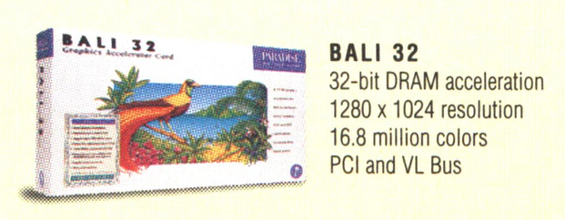
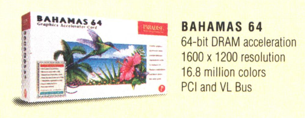
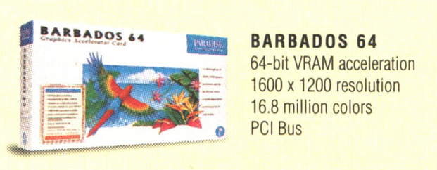
Image source: PC World May 1995.
These appear to be the last products with an illustration done to the level resembling an artwork you could frame and hang, but the available scan and print resolution is quite low. At low resolution, the art style looks quite similar to the 1988 and 1991 cards. However, with these new box designs, there is a visible change to confine the colourful illustration mostly to a smaller bounding box. Speculation: in addition to the size of the artwork, the print quality may have been reduced as a cost-saving measure, and perhaps the budget for the artist. My confidence for guessing if this one is the same artist is slightly lower, just from having diverged from the original format, I am less willing to say one way or the other.
Date: 1993
This was a multi-feature VLB card, with VGA, 2x floppy, 1x game port, 1x 40-pin IDE, 1x parallel port, 2x serial port, and VESA feature connector.
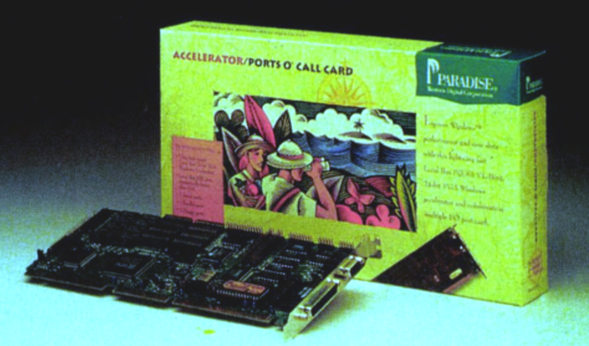
Image source: Science et vie Micro Jan 1994.
Style-wise, this does not fit with the previous card box art, the illustration style resembles linoprint. The imagery is the adventurer-colonial-safari-explorer-gentleman outfit, recognisable by the pith hats. Why did they go with this name? I know a port of call is a stop on a nautical journey, and so ports of call would be multiple stops. Is the plural ports a pun on the existence of many ports the card has?
Oh dear. It could be that simple.
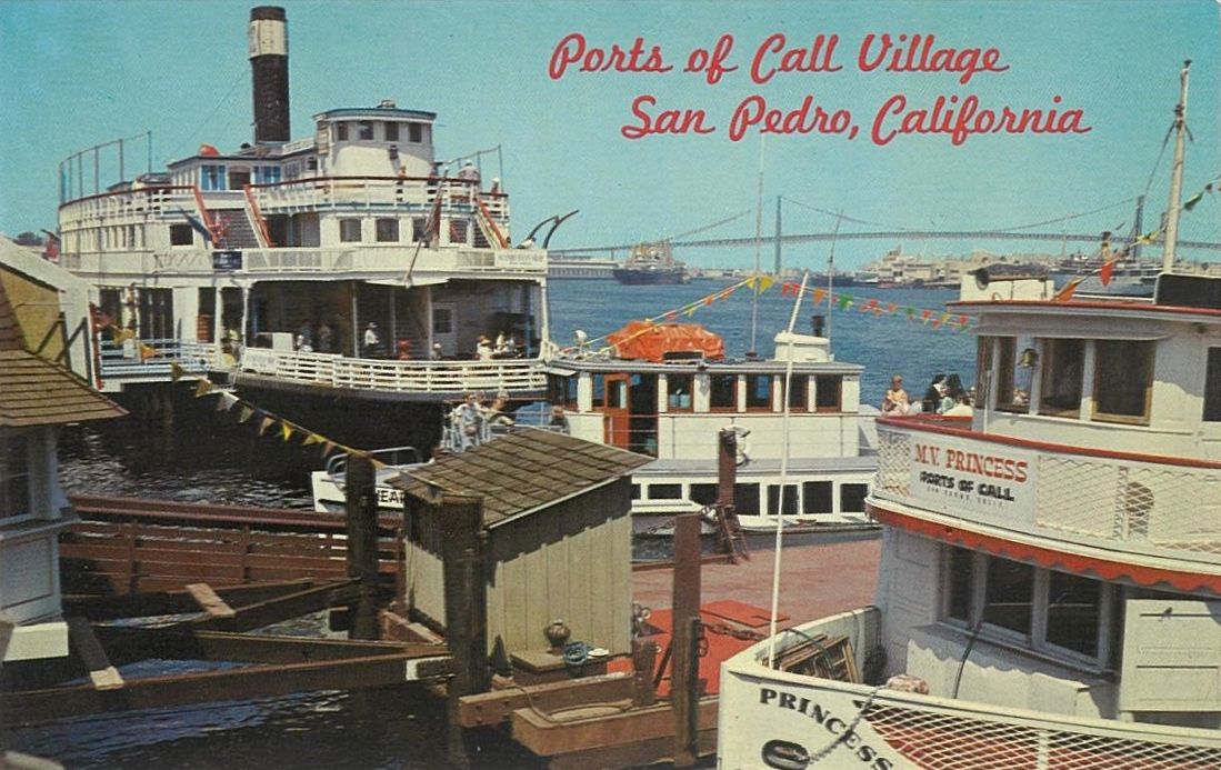
Image source: Archive.org.
Perhaps also a reference to (or inspired by) the multi-themed Ports O' Call Village entertainment area in San Pedro, California. Demolished in 2018 due to redevelopment, the seaside entertainment venue was created by David Tallichet, a former WWII pilot, in collaboration with Vern Lecker, an established LA architect.
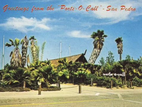
An undated postcard of the Ports O' Call restaurant located within the village.
Image source: mytiki.life.
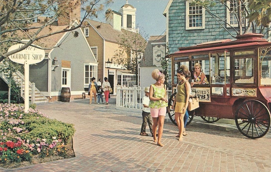
An undated postcard showing a view of the New England theme in Ports O' Call Village
Image source: Archive.org.
Opening in 1963, it offered shopping and dining experiences of a New England fishing port, old California, and a Polynesian restaurant surrounded by a tropical garden.
The Polynesian themed Ports O' Call restaurant was part of the post-war Tiki craze. Some say Ports O' Call Village served as a model for Lake Beuna Vista at Disney World in Florida. A 1978 CBS TV news report mentions as much too. The site attracted more than 2 million visitors per year during its height, but and continued to be largely successful into the 1980s, so would have been likely to loom large in some people's memories. The report is just a few minutes long:
Ports O' Call village, a shopping and entertainment destination, packs many ports of call into one close-knit location... like the multi-function Paradise Ports O' Call VLB card too.
With all that said, while I am not super interested in who the artist was for the Paradise Ports O' Call box artwork, if anyone does know, send me an email and I will add credit.
i.e. these:
As far as I could tell, Paradise (Western Digital) did not credit the artist for the box art involving nature scenes, so I started drawing some comparisons without any authoritative source to go on. I spent some amount of time searching for artists who made works resembling the Naïve style of Henri Rousseau's works:
This page is a journal of what I looked at when I felt like I had a good guess, so there is some degree of hopping from one thought to the next.
Tropical exoticism was big in the 70s, 80s, and 90s travel industry, and luxury brands leveraged exoticism hard. Tropical island places like Tahiti, Fiji, and Barbados were being marketed as rare and exotic. Paradise (Western Digital) is tapping into some of the same themes with their marketing and design from this period. The palm tree logo and the brand name are early warning signs that scream it if you look at it that way.
However, for me there are two different associations with the artwork presented here.
Firstly, I have an association with late 80s and early 90s computing with the paradise images because of the Paradise brand, primed at an early age. I am almost certain I saw one of the boxes on display at a friend's place, as their father filled the shelves of their designated computer room with their hardware and software collection. It gave something for the eye to wander to while we were waiting for slower CD-ROM games to constantly load all the time, like Myst (1993) and Hell Cab (1993).
Secondly, plants like lotus, hibiscus, bromeliads, birds of paradise, palms, passionfruit flowers, etc. are easily found plants in temperate-to-warm areas of Australia. While these plants are great to enjoy, they do adorn a lot of yards and gardens, so there is a kind of warm familiarity to them, which makes seeing them in the box artwork resonate in a very familiar way.
We also have no shortage of colourful wild birds, and so the early Paradise product images remind me of the birds I grew up with outdoors. I imagine this kind of flora/fauna association is also prevalent for others in warmer places elsewhere in the world such as Hawaii, California, Florida, Georgia, etc.
To illustrate that, here is a selection of recognisable birds and plants for a fairly large section of east coast Australia.


After browsing the works of a dozen artists and eliminating many for style differences, I found one artist who was interesting. It turned out that I already knew of them from at least the early 2000s.
Cover art by Gary Overacre for Bobos in Paradise: The New Upper Class and How They Got There by David Brooks (2000):
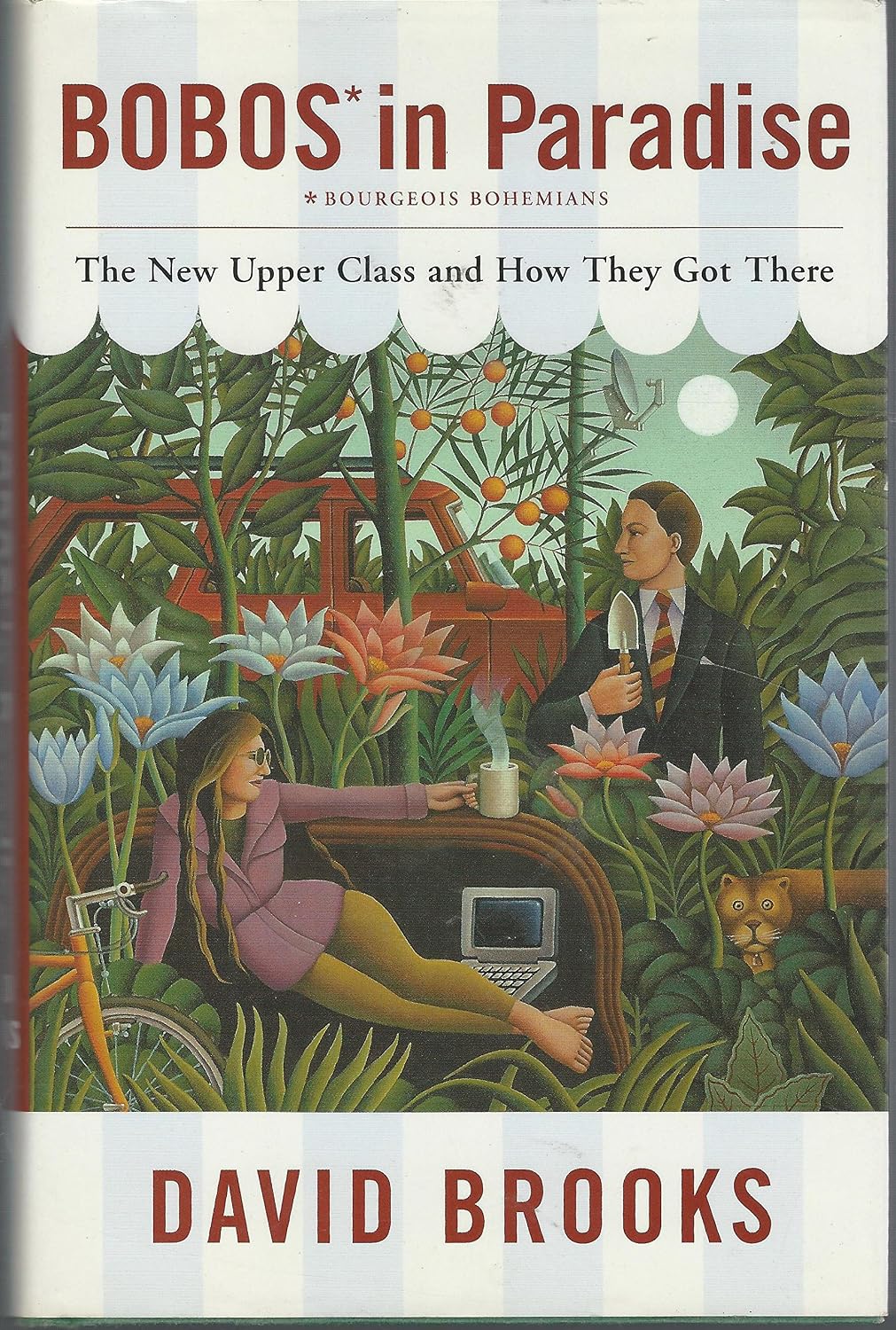
Image source: amazon.com.au.
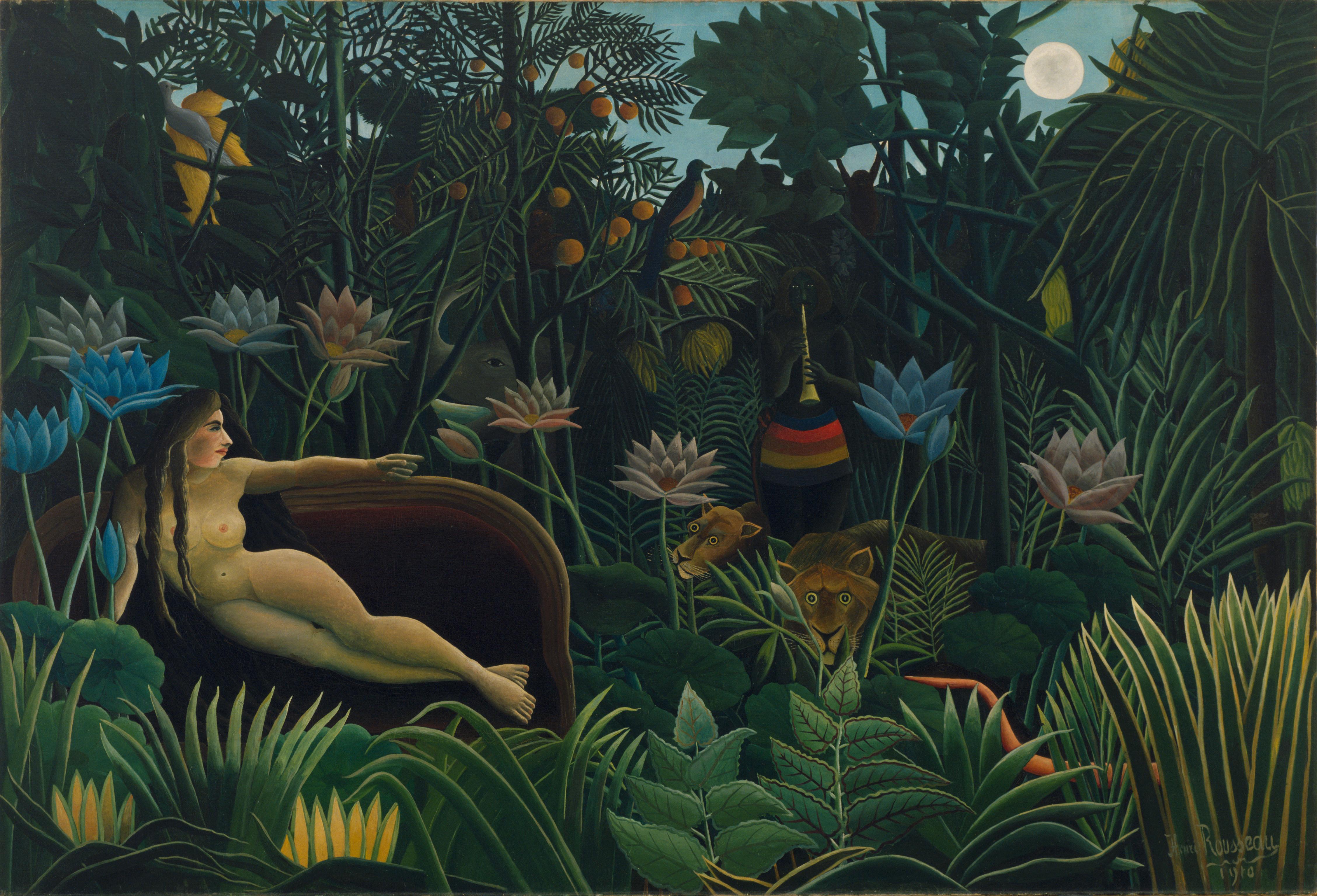
This book cover came up in the image search results when looking for similar images to the work of Henri Rousseau (1844-1910). I had been looking at Rousseau in the context of the Paradise EGA 480 Card, for having immediately recognised the similarity to Rousseau's The Flamingoes (1907).
Pictured below, Henri Rousseau's The Dream (1910):
Image source: Wikipedia.
Note the positions the lotus flowers, the pose and hairfall of the woman, the position of the jungle cat, the oranges and leaf shape.
Henri Rousseau never left France, and so the basis of their jungle work was a combination of a strong imagination, and studying material available between the Natural History Museum, and visiting the greenhouse at the Jardin des Plantes, in Paris where they lived.
For biography and additional pictures of their work, see: Meet Henri Rousseau, the Untrained Artist Who Wouldn’t Quit Painting—Despite the Ridicule He Received From Critics, Smithsonian Magazine (2025).
The Nature Company 1989 -1990 Catalogue.
"The Daily Planet" — 1990 Calendar, Notecube and Atlas of the Natural World in One!
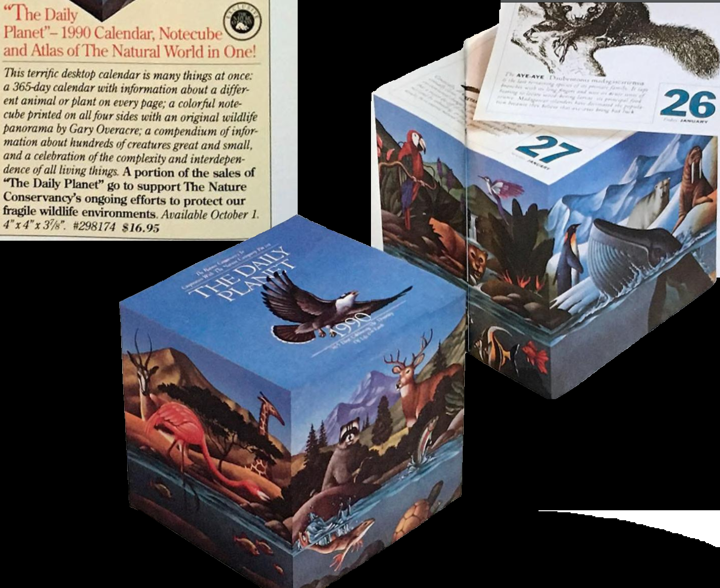
Image source: Archive.org.
Showcasing the full Gary Overacre illustration in two rotations, this includes a tropical biome. Both the plants and the bird above it are in a similar style to the Paradise VGA Plus 16 Card (1988):
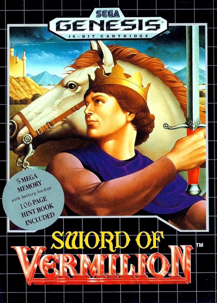
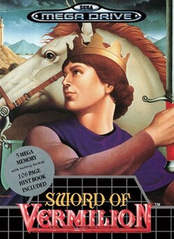
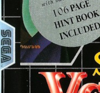
This Japanese developed game received new cover art (for the case, manual and hint guide) by Gary Overacre. The first thing to note is the presence of a flipped Overacre signature in the lower left, which a silver circular sticker can be seen covering the game case on many, but not all copies (if one looks at eBay listings for the game). Did they not notice the presence of the signature until after the print run, and then made stickers to cover it up for the case insert, but not the bundled strategy guide? If presentation on the shelf is all that mattered, then maybe the half-measure was chosen.
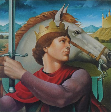
The vermilion red cape in Gary Overacre's version becomes purple-blue in the Sega version. The sword hilt changes from grey-black to red in the Sega version. The subject of the portrait has less of a rosy hue in the Sega version, instead looking slightly darker/tan (not sure how much of the colour changes are intentional vs print quality, aging, and photography). The sky also appears darker in the Sega version.
UNIX MAGIC (1986)

Image source: flickr.
UNIX VIEWS (1988)

Image source: flickr.
UNIX FEUDS (1990):

Image source: flickr.
Many readers, if they happen to be familiar with some UNIX computing history culture, will recognise the name Gary Overacre from the highly sought after posters published by UniTech Software, originally distributed at USENIX conferences.
Gary Overacre worked as a professional illustrator active from at least the 1970s into the 2000s, and was so well represented that by 1987 they had completed illustration work for IBM, the U.S. Postal Service, the U.S. Army, General Foods, McDonalds, Burger King, Bell South, Du Pont, Merrill-Lynch, United Artists, United Airlines, Atari, Coca-Cola, Exxon, AT&T, Proctor & Gamble, Dow Chemical, General Electric, American Express, Time, Playboy, Oui, Penthouse, The Nature Company, T.V. Guide, and many others. (Source: American illustration showcase - Volume 10 (1987)).
From the archived version of his website; "Gary Overacre is a native of Virginia, grew up in Savannah, GA, and earned a Bachelor of Fine Arts degree from the University of Georgia".
After some searching, I was able to find a few more examples of Overacre's work from this time (beyond the UNIX posters obsession and the Bobos in Paradise book cover), but what I did find was far from a full catalog of Overacre's work readily available.
One site associated with an android app and apps specific to Russia has been in the "Gary Overacre" search results for a while. I put that site aside casting skepticism on it for having no explanation on the entry, and for also selling AI image generation services.
So I decided to ask other people.
I posted an example of the Paradise video card box art on Mastodon, and asked if anyone recognised the artist:
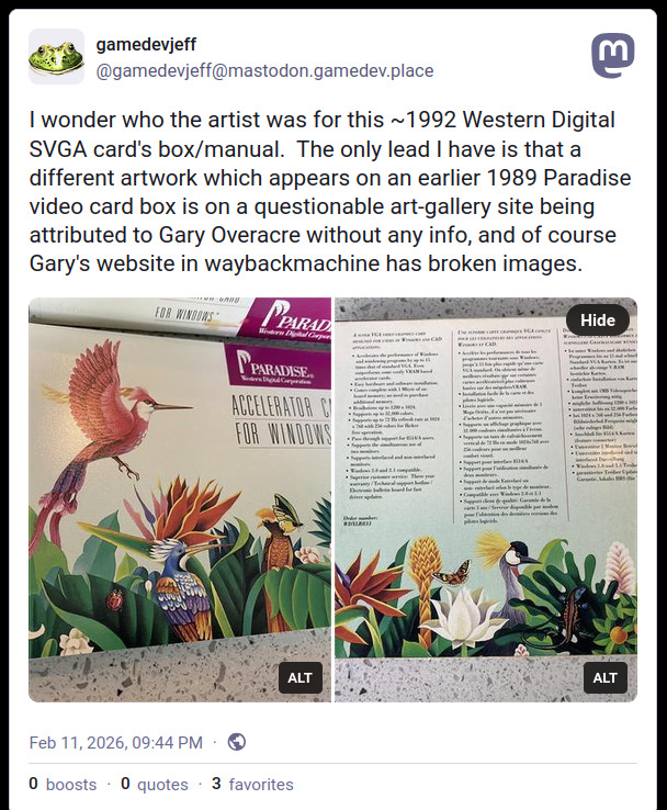
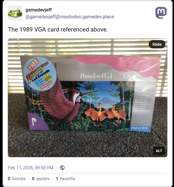
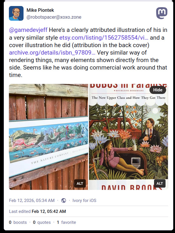
In reply, robotspacer shared a link to a grand poster format of The Nature Company artwork I had seen in low res on the Notecube product listing in the catalog, and agreed the style was very similar to the Paradise video card box art:
I left it at that for months, being busy with other things, before resuming the search for further comparisons.
Unable to get over having thoughts about where I left the investigation, and how impressive the birds and other animals are in the box art scenes, I started looking again for more of Gary Overacre's work to examine it closely. What I was looking for was to understand elements of style, possible influences, and to see the consistency of rendering.
This illustration by Gary Overacre is in the style that closely resembles 1930s-1940s American Social Realism.
Title: RESOURCE 2000. AN ALLIANCE FOR PROGRESS AND PROFIT for Bausch & Lomb:
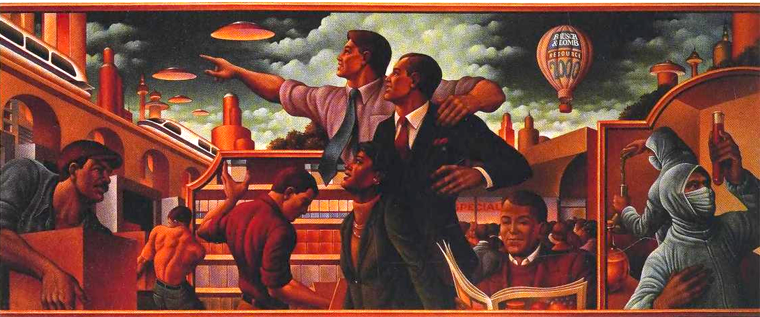
Image source: Graphis Poster 93 (1993).
In Gary Overacre's illustration, we see a mural of visibly muscular workers, some are doing blue collar work and some carrying out white collar work (chemistry), but moving with the times there is more diverse representation. The illustration is for Bausch & Lomb, a producer of eye-care products. Advertising a new initiative to help its retail customers save money, evoking a spirit of cooperation and mutual success.
Now compare the style to Seymour Fogel's Wealth of a Nation (1938):

Image source: Wikipedia.
Wealth of a Nation is described as an interpretation of the themes of FDR's Social Security and plans to recover from The Great Depression. The workers are muscular. There is a mix of blue and white collar work happening to the effect of stimulating the American economy. On the left we see test tubes, a beaker, and a microscope with a man in a jacket, tie and dress shoes. Meanwhile, a shirtless worker pulls a lever connected to the gears of industry, and yellow arcs of current flow from a transformer terminal. Fogel painted the mural on commission from the Public Works for Arts Project, part of FDR's New Deal.
Gary Overacre's cover illustration for Motives for Writing by Robert Keith Miller, and Suzanne S. Webb (1991):
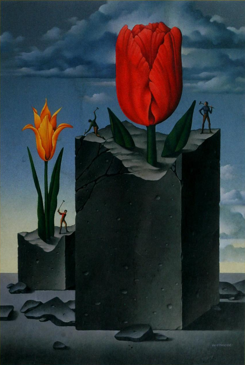
Image source: Archive.org.
This illustration features flowers with yellow-orange color gradients and texturing/lighting not dissimilar to the bird of paradise flower on the Paradise VGA Plus (or the twin birds in Paradise VGA 1024 Card):
The workers could also look at home in an American Social Realism mural. We observe as they chisel and sledge hammer flowers from a rock, a metaphor for the writing process.
The Disposable Male: Sex, Love, and Money (2006) by Michael Gilbert, with cover illustration by Gary Overacre:
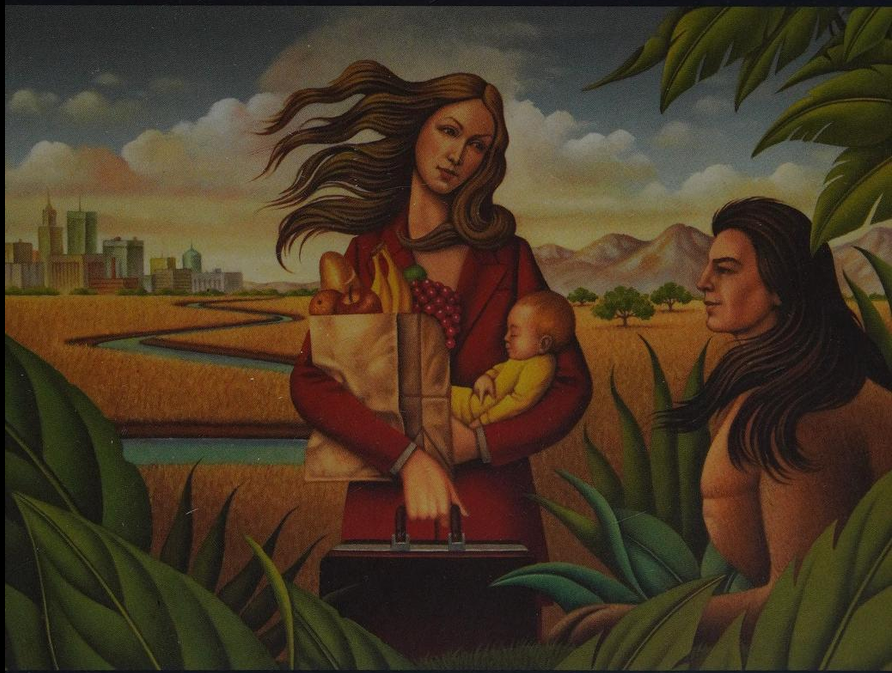
Image source: Archive.org.
The broad leaves in Overacre's illustration closely resemble the style of those in two Paradise works:
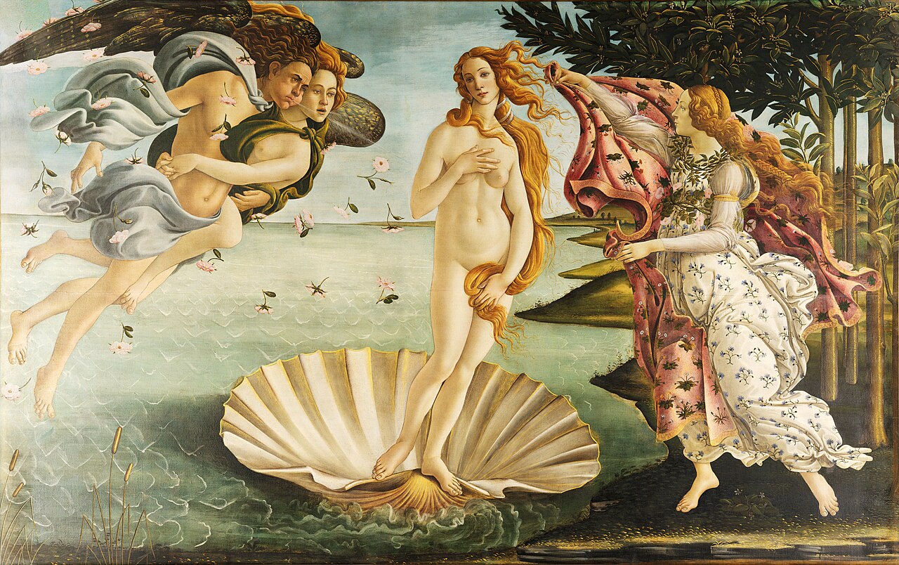
A crop of Venus:
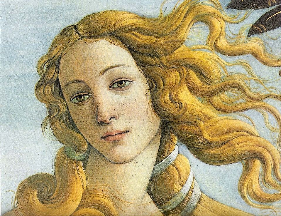
Image source: Wikipedia.
Over the course of my archaeology, I came across many more wonderful examples of Overacre's work, but I am mindful not to add them here just for the sake of being a fan. I set out to document this for educational purposes with regards to the original Paradise products, after all.
From these examples, I see strong consistency in rendering plants with broad leaves across the multiple examples examined here. Secondly, Overacre is very skilled at capturing historical work in a subset of his own works. One can see the presence of stylistic elements of Rousseau (1844-1910), Magritte (1898-1967), Botticelli (1455-1510), and other artists, while still maintaining his own signature look.
After sifting through hits for "Gary Overacre" on Google Books, and managing to locate readable copies of some via library lending, I finally found what I was hoping to find!
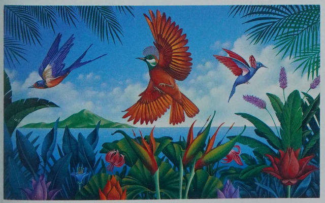
Image source: American showcase - illustration. Volume 13 (1990).
Yes! It is the work from the Paradise VGA Plus 16 Card, and the image is credited to Gary Overacre.
As luck would have it, I found it and the path to finding the confirmation was a scenic detour. I could have very well ended up arriving upon the final image first.
As far as these images are concerned:
I have good evidence that the attribution can be made to Gary Overacre. When it comes to the others, I would say it is plausible, but I am a little less sure due to factors like cost reduction or negotiating lower rates with the artist resulting in faster, good looking, but not over the top, out of this world work. Some degree of mystery still remains!
Thanks for reading!
Feel free to email me comments, corrections, box art photography, etc. .


